> For the complete documentation index, see [llms.txt](https://alex-15.gitbook.io/bootstrap/llms.txt). Markdown versions of documentation pages are available by appending `.md` to page URLs; this page is available as [Markdown](https://alex-15.gitbook.io/bootstrap/bootstrap_4_alpha.md).
# Bootstrap Alpha: Super Smart Features to Win You Over

## Bootstrap Alpha: Super Smart Features to Win You Over
By Maria Antonietta Perna
After months of anticipation, anxious tweets asking for the disclosure of a release date, and a few scattered [scraps of news](https://twitter.com/mdo/status/591364406816079873) by [Mark Otto](http://markdotto.com/) and [Jacob Thornton](http://twitter.com/fat), having the effect of intensifying rather than quenching our curiosity, [Bootstrap 4 alpha](http://blog.getbootstrap.com/2015/08/19/bootstrap-4-alpha/) is out.
As a designer, I love crafting my own CSS. However, I confess, I find Bootstrap such a well thought-out and strongly supported front-end framework that I’ve immensely enjoyed using it, both to build my projects and to learn more about writing better, modular CSS.
After the much awaited news, as you can probably guess, I downloaded the [source files for Bootstrap 4](http://v4-alpha.getbootstrap.com/getting-started/download/) and spent some time going back and forth between reading [the docs](http://v4-alpha.getbootstrap.com/) and digging into the code to find out more.
I expect the alpha release of Bootstrap 4 will undergo a number of changes in the coming weeks, even months. The curious among you, can keep an eye on [the issues section of the project’s GitHub repository](https://github.com/twbs/bootstrap/issues).
However, the features I’m going to list here are more like broad coding principles and practices that keep improving on each new release of the framework. That’s why I think it’s likely they’re here to stay. If anything, they can only get better.
Here they are. I hope you find them awesome too!
### New Interactive Documentation
The Bootstrap documentation has been exemplary since the framework’s early days. It’s always had the crucial role of being a **living document**, that is, a tool in sync with the collaborative effort of building the framework and communicating it to others:
> Abstracting and documenting components became part of our process for building this one tool and Bootstrap in tandem. [*Mark Otto in 2012*](http://alistapart.com/article/building-twitter-bootstrap)
Mark himself is quite a fan of great documentation. His [Code Guide by @mdo](http://codeguide.co/) is evidence of his approach to high quality documentation as being part and parcel of outstandingly coded projects.
The documentation for version 4 has been rewritten from scratch using [Markdown](http://daringfireball.net/projects/markdown/). Understandably, given the alpha stage of this version at the time of writing, it’s still a work in progress.
The Bootstrap docs …
* are a pleasure to navigate, both using the traditional sidebar navigation and the brand new **search form**.
* structure information in a logical manner; content is never overwhelming or confusing.
* include instructions and how-tos covering all areas of the framework, from different ways of installing Bootstrap to using each component and dealing with browser quirks.
If you take the time, you’ll soon find a few valuable nuggets scattered throughout various sections of the docs. For instance, dealing with over-sized SVG images that use the `.img-responsive` class in IE9-10, **accessibility** best practices, enabling the [mq4-hover-shim](https://github.com/twbs/mq4-hover-shim) to fix sticky `:hover` styles on mobile devices, and much more.
Finally, if you’d like to run the Bootstrap docs locally on your computer, install [Jekyll](http://jekyllrb.com/), a great website building tool, and follow [these instructions](https://github.com/twbs/bootstrap/tree/v4-dev#documentation).
### Top-notch Modular Architecture
Bootstrap has often been the target of complaints about code bloat, too opinionated CSS styling, and a profuse quantity of components. The good news is: Bootstrap 4 has both simplified and further modularized its structure.
To begin with, some components have been eliminated altogether: the [Glyphicons](http://glyphicons.com/) icon library is not bundled with the framework any more; panels, wells, and thumbnails are replaced by the [Cards](http://v4-alpha.getbootstrap.com/components/card/) component. Also, all CSS reset/normalize code and basic styling are now dealt with in a single brand new module called [Reboot](http://v4-alpha.getbootstrap.com/content/reboot/).
Further, more than ever before, using Bootstrap now feels like assembling and arranging Lego blocks in different ways. Here are some examples to clarify what I mean.
#### Opt-in Modules
You can quickly control the application of complex CSS features by toggling the value of a Boolean SCSS variable. Grab your copy of the Bootstrap 4 alpha release [source files](http://v4-alpha.getbootstrap.com/getting-started/download/), open `_variables.scss` in a code editor, and find the following snippet (at about line 46):
```css
$enable-flex: false !default;
$enable-rounded: true !default;
$enable-shadows: false !default;
$enable-gradients: false !default;
$enable-transitions: false !default;
```
Toggling the value of one of the above variables from `true` to `false` or vice versa, and compiling the code, will enable or disable the corresponding CSS property in your project.
Let’s have a go at turning a traditional Bootstrap grid into a cool [Flexbox](http://www.sitepoint.com/are-we-ready-to-use-flexbox/)-powered grid.
Here’s the HTML for a regular Bootstrap three-column grid:
```markup
Col 1
Lorem ipsum dolor sit amet, consectetur adipisicing elit.
```
This is what it looks like in the browser:

Look into the source code using the developer tools of your browser of choice. The CSS rules corresponding to the `.row` class should look like the image below:

Next, set the `$enable-flex` variable to `true`, compile and refresh the browser. Although the browser display is the same as before, the CSS is different. The `.row` class turns its element into a **flex container** with the `flex-wrap` property set to `wrap`. This ensures that child elements exceeding the container’s width wrap to the next row.

#### Ready-made Light-weight Versions
Besides `bootstrap.scss`, which includes the entire framework, you’ll also find the following files: `bootstrap-flex.scss`, `bootstrap-grid.scss`, and `bootstrap-reboot.scss`.
Each of these files includes only **selected portions** of Bootstrap. If you don’t need the full-blown framework in your project, this is a great head-start: just compile one of the light-weight options and you’re good to go.
Corresponding cut-down compiled packages will be made available for download from the Bootstrap 4 docs page.
#### Reusable Components
You can skin and modify components by mixing and matching a few classes. For instance, the brand new [Cards](http://v4-alpha.getbootstrap.com/components/card/) component is a great example of this versatility in action.
Here’s all the HTML you need for the simplest instance of this component:
```markup
Just some text.
```
Below is how the code looks in the browser in a three-column layout:

This flexible component easily adapts to a variety of content types. Here’s an instance that includes an image, text, links, and a list:
```markup
Card title
The Cards component nicely fits an image on top,
some text, a list, and a couple of links.
```
And below is the result in the browser in a three-column layout:

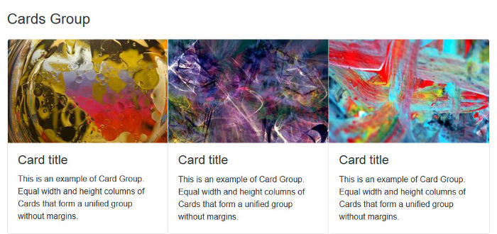
You can also arrange cards in [touching equal width and height columns](http://v4-alpha.getbootstrap.com/components/card/#groups) by wrapping them in a `.card-group` container:
```markup
```
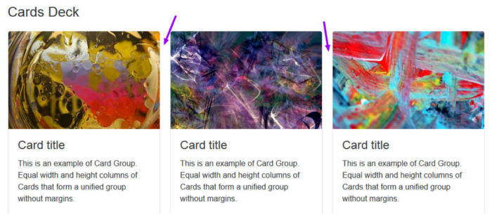
Alternatively, you can group Cards having equal width and height [columns with margins](http://v4-alpha.getbootstrap.com/components/card/#decks), using `.card-deck-wrapper` and `.card-deck` as follows:
```markup
```
Another cool thing you can do with Cards is build a [Masonry](http://masonry.desandro.com/)-like layout. Just wrap the cards in a container with the `.card-columns` class and leave the rest to Bootstrap.
```markup
```
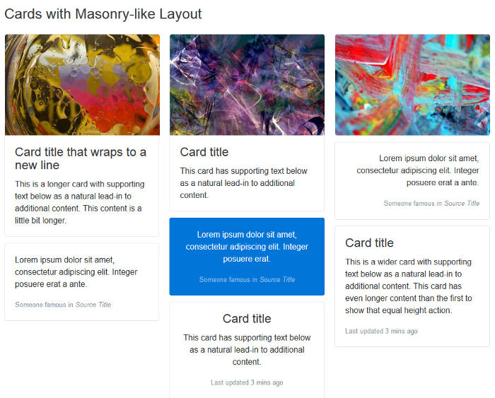
To dive into the details of the Masonry-like Cards layout, as well as exploring further what you can do with Cards, check out the [Cards docs](http://v4-alpha.getbootstrap.com/components/card/#columns).
Here I’ve offered only a few examples of Bootstrap’s modular architecture. I think these suffice to show how flexibility and extensibility are built into the framework as a whole, which makes it fun and convenient to use.
### Easier Scaling Across Screen Sizes
Since version 3, Bootstrap has introduced a **mobile-first** approach to web design, i.e., start developing for smaller screens first and progressively add or adjust features as you target larger screens. Version 4 makes further improvements towards adaptive web design by taking the following steps.
#### The Move to `rem`
Bootstrap 4 replaces most instances where the absolute unit of measurement in `px` was applied in the earlier version with relative `rem` and, for media queries, `em` units. The goal is to have all elements on a web page harmoniously scale with the screen size.
Let’s have a look at how Bootstrap sets the global `font-size`. Start by opening `_reboot.scss` in a code editor and find the following snippet (about line 60):
```css
html {
// Sets a specific default `font-size` for user with `rem` type scales.
font-size: $font-size-root;
/* etc... */
}
body {
// Make the `body` use the `font-size-root`
font-size: $font-size-base;
/* etc... */
}
```
If you dig into `_variables.scss`, you’ll see that `$font-size-root` is set to `16px` and `$font-size-base` is set to `1rem`. This means that dividing any measurement in `px` by 16, you’ll come up with the corresponding `rem` measurement, e.g., to get the corresponding `rem` measurement for `40px`, perform this operation: *40 / 16 = 2.5*.
Most importantly, this means it’s easier to build web pages where all elements proportionally scale up or down with the screen size without messing up your beautiful design.
#### Here Comes the Extra-large Breakpoint
The introduction of the new **extra large breakpoint** for the grid system further helps building layouts that scale well across different screen sizes.
This breakpoint is applied using the `.col-xl-` class and is triggered on screen sizes from `75em` upwards.
#### Global Margins Reset and Utility Spacer Classes
Forcing consistent spacing between elements in a design is something most front-end developers, including myself, obsess over. It’s a demanding task and the plethora of screen resolutions available doesn't make the job easier.
To help us keep both vertical and horizontal spacing between elements under tight control, Bootstrap 4 resets `margin-top` to `0` while keeping a consistent `margin-bottom` value on all elements.
Further, the framework offers an impressive number of [utility classes](http://v4-alpha.getbootstrap.com/components/utilities/#spacing) to make it easier for us to adjust margins and padding at a more granular level across varying screen sizes.
### Conclusion
At the dawn of the Bootstrap 4 alpha release, I’ve introduced three broad features that in my view make this front-end framework really stand out:
* Great documentation
* Mega Lego type architecture
* Easier scaling across devices
Did you notice I didn’t mention Bootstrap’s move from Less to Sass? Or the rewrite of all JavaScript plugins in [ECMAScript 6](https://github.com/lukehoban/es6features/blob/master/README.md)?
I consider these to be more like indications of Bootstrap staying current and taking advantage of the latest tools, rather than features integral to the framework itself.
---
# Agent Instructions
This documentation is published with GitBook. GitBook is the documentation platform designed so that both humans and AI agents can read, navigate, and reason over technical content effectively. Learn more at gitbook.com.
## Querying This Documentation
If you need additional information that is not directly available in this page, you can query the documentation dynamically by asking a question.
Perform an HTTP GET request on the current page URL with the `ask` query parameter, and the optional `goal` query parameter:
```
GET https://alex-15.gitbook.io/bootstrap/bootstrap_4_alpha.md?ask=&goal=
```
`ask` is the immediate question: it should be specific, self-contained, and written in natural language.
`goal` is optional and describes the broader end goal you are ultimately trying to accomplish on behalf of the user. GitBook uses it to tailor the answer towards what is most useful for that goal.
The response will contain a direct answer to the question and relevant excerpts and sources from the documentation.
Use this mechanism when the answer is not explicitly present in the current page, you need clarification or additional context, or you want to retrieve related documentation sections.