# Getting Bootstrap to Play Nice With Masonry

## Getting Bootstrap to Play Nice With Masonry
By Maria Antonietta Perna
On the [Masonry website](http://masonry.desandro.com/), we read that Masonry is...
> … a JavaScript grid layout library. It works by placing elements in optimal position based on available vertical space, sort of like a mason fitting stones in a wall.
[Bootstrap](http://getbootstrap.com/) is one of the most widely adopted open source front-end frameworks. Include Bootstrap in your project, and you’ll be able to whip up responsive web pages in no time.
If you tried using Masonry together with the [Tabs widget](http://getbootstrap.com/javascript/#tabs), one of the many JavaScript components Bootstrap has to offer, chances are you’ve stumbled on some kind of annoying behavior. I did, and this article highlights what the issue is and what you can do to solve it.
### Bootstrap Tabs Explained
Bootstrap’s Tabs component includes two key, related pieces: a tabbed navigation element and a number of content panels. On page load, the first panel has the class `.active` applied to it. This enables the panel to be visible by default. This class is used via JavaScript to toggle the panel’s visibility via the events triggered by the tabbed navigation links: if `.active` is present the panel is visible, otherwise the panel is hidden.
If you have some web content that’s best presented in individual chunks, rather than crammed all in one spot, this kind of tabs component might come in handy.
### Why Masonry?
In some cases, the content inside each panel is suited to being displayed in a responsive grid layout. For instance, a range of products, services, and portfolio items are types of content that can be displayed in grid format. However, if grid cells are not of the same height, something like what you see below can happen.
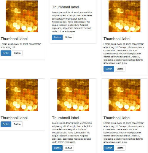
A wide gap separates the two rows of content and the layout appears broken.
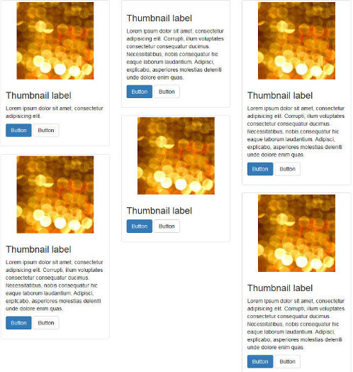
That’s when Masonry saves the day. Add some Masonry magic to the mix and your grid dynamically adapts to the screen real estate, eliminating all ghastly gaps.
### Setting Up a Demo Page
Getting a demo page up and running helps to show how integrating Bootstrap’s Tabs with Masonry is not as straightforward as one expects. This article’s is based on the [Starter Template](http://getbootstrap.com/getting-started/#examples), available on the Bootstrap website.
[CodePen demo page - http://codepen.io/SitePoint/pen/mywEMR/](http://codepen.io/SitePoint/pen/mywEMR/)
Each grid item inside the tab panels is built with the [Bootstrap grid system](http://getbootstrap.com/css/#grid) and the [Bootstrap Thumbnails](http://getbootstrap.com/components/#thumbnails) component. Here’s a code snippet to illustrate its structure:
```markup
```
The code above builds a three-column grid on large to medium screens and a two-column grid on smaller screens. If you need a refresher on the Bootstrap grid system, [Understanding Bootstrap’s Grid System](http://www.sitepoint.com/understanding-bootstrap-grid-system/) by Syed Fazle Rahman is a great read.
The Tabs widget in the demo page has the following HTML structure:
```markup
```
Here are a few things to note about the code snippet above:
* HTML comments point to the Tab’s key components: **Nav tabs** marks the tabbed navigation section, and **Nav panels** marks the content panels.
* The tabbed links connect to the corresponding content panel through the value of their `href` attribute, which is the same as the value of the `id` attribute of the content panel. For instance, the link with `href="#panel-1"` opens the content panel with `id=panel-1`.
* Each anchor tag in the navigation section includes `data-toggle="tab"`. This markup enables the tabs component to work without writing any additional JavaScript.
* Finally, the elements that Masonry needs to target have a class of `.masonry-container` that apply to the wrapper `div` element that encompasses all the grid items and a class of `.item` that apply to each single grid item.
To see the full power of the Masonry library, make sure the grid items are of varying heights. For instance, delete the image on one item, shorten a paragraph on another, etc.
For the full code, check out the code panels in the CodePen demo.
### Adding the Masonry Library
You can [download Masonry](http://masonry.desandro.com/) from the official website by clicking on the Download masonry.pkgd.min.js button.
To avoid layout issues, the library’s author recommends using Masonry together with the [imagesLoaded plugin](http://imagesloaded.desandro.com/).
Masonry doesn’t need the [jQuery library](http://jquery.com/) to work. However, because the Bootstrap JavaScript components already use jQuery, I’ll be making life easier for myself and initialize Masonry the jQuery way.
Here’s the code snippet we need to initialize Masonry using jQuery and imagesLoaded.
```javascript
var $container = $('.masonry-container');
$container.imagesLoaded( function () {
$container.masonry({
columnWidth: '.item',
itemSelector: '.item'
});
});
```
The code above caches the `div` that wraps all the grid items in a variable called `$container`.
Next, Masonry is initialized on `$container` with a couple of recommended options. The `columnWidth` option indicates the width of a column of a horizontal grid. Here it is set to the width of the single grid item by using its class name. The `itemSelector` option indicates which child elements are to be used as item elements. Here, it’s also set to the single grid item.
It’s now time to test the code.
### Oops! What’s up with the Hidden Panels?
On a web page that doesn’t use Bootstrap Tabs, the code above works like a charm. However, in this case, you soon realize a kind of funny behavior occurs.
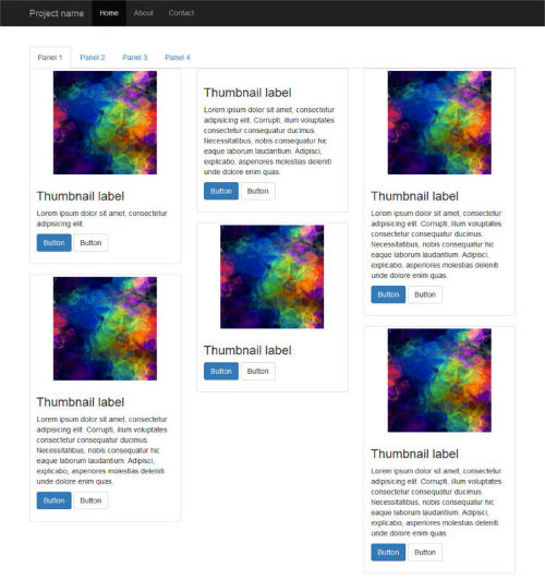
First, it seems fine because the grid inside the default active tab panel is displayed correctly:
However, if you click on a tabbed navigation link to reveal the hidden panel’s content, here’s what happens:
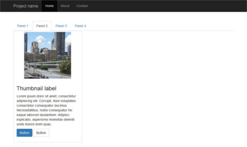
Peeking inside the source code reveals that Masonry has fired as expected, but the position of each item is not being calculated correctly: grid items are all stacked on top of each other like a pack of cards.
And that’s not all. Resizing the browser window causes the grid items to position themselves correctly.
#### Let’s Fix the Layout Bug
Since the unexpected layout bug becomes apparent after clicking on a tabbed navigation link, let’s look into the events fired by Bootstrap’s Tabs a bit more closely.
The [events list](http://getbootstrap.com/javascript/#tabs) is quite short. Here it is.
* **show\.bs.tab** fires on tab show, but before the new tab has been shown.
* **shown.bs.tab** fires on tab show after a tab has been shown.
* **hide.bs.tab** fires when a new tab is to be shown (and thus the previous active tab is to be hidden).
* **hidden.bs.tab** fires after a new tab is shown (and thus the previous active tab is hidden).
Because the grid layout gets messed up after a tab has been shown, we go for the shown.bs.tab event. Here’s the code, which we place just below the previous snippet:
```javascript
$('a[data-toggle=tab]').each(function () {
var $this = $(this);
$this.on('shown.bs.tab', function () {
$container.imagesLoaded( function () {
$container.masonry({
columnWidth: '.item',
itemSelector: '.item'
});
});
});
});
```
Here’s what happens in the code above:
The [jQuery .each()](http://api.jquery.com/jquery.each/) function loops over each tabbed navigation link and listens for the `shown.bs.tab` event. As the event fires, the panel becomes visible and Masonry is re-initialized after all images have finished loading.
### Let’s Test the Code
If you’ve been following along, try out the CodePen demo below to check out the result:
[Getting Bootstrap Tabs to Play Nice with the Masonry Library](http://codepen.io/SitePoint/pen/mywEMR/)
Click on a tabbed navigation link and notice how this time the grid items fit evenly inside each content panel. Resizing the browser causes the items to reposition themselves correctly with a nice animation effect.
That’s it, job done!
### Conclusion
In this article I’ve shown how to integrate Bootstrap’s Tabs component with the Masonry JavaScript library.
Both scripts are easy to use and quite powerful. However, put them together and you’ll face some annoying layout bugs affecting the hidden tabs. As shown above, the trick is to re-initialize the Masonry library after each panel becomes visible.
With this solution in your toolbox, achieving great tiled layouts will be a breeze.
---
# Agent Instructions: Querying This Documentation
If you need additional information that is not directly available in this page, you can query the documentation dynamically by asking a question.
Perform an HTTP GET request on the current page URL with the `ask` query parameter:
```
GET https://alex-15.gitbook.io/bootstrap/getting_bootstrap_to_play_nice_with_masonry.md?ask=
```
The question should be specific, self-contained, and written in natural language.
The response will contain a direct answer to the question and relevant excerpts and sources from the documentation.
Use this mechanism when the answer is not explicitly present in the current page, you need clarification or additional context, or you want to retrieve related documentation sections.