# Understanding Bootstrap Modals

## Understanding Bootstrap Modals
By Syed Fazle Rahman
Everyone who spends a bit of time and effort researching the Bootstrap framework can understand how easy it is to use for novice designers. It ships with some of the best ready-to-use JavaScript and jQuery components and plugins. Here we will be talking about one of the most useful jQuery Bootstrap plugins - [**The Modal**](http://getbootstrap.com/javascript/#modals).
**The Bootstrap Modal** is a lightweight multi-purpose JavaScript popup that is customizable and responsive. It can be used to display alert popups, videos, and images in a website. Websites built with Bootstrap can use the modal to showcase (for example) terms and conditions (as part of a signup process), videos (similar to a standard light box), or even social media widgets.
Now let’s examine the different parts of Bootstrap’s modal, so we can understand it better.
The Bootstrap Modal is divided into three primary sections: the header, body, and footer. Each has its own significance and hence should be used properly. We’ll discuss these shortly. The most exciting thing about Bootstrap’s modal? You don’t have to write a single line of JavaScript to use it! All the code and styles are predefined by Bootstrap. All that’s required is that you use the proper markup and the attributes to trigger it.
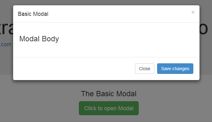
### The Default Modal
The default Bootstrap Modal looks like this:
To trigger the modal, you’ll need to include a link or a button. The markup for the trigger element might look like this:
```markup
Click to open Modal
```
Notice the link element has two custom data attributes: `data-toggle` and `data-target`. The toggle tells Bootstrap what to do and the target tells Bootstrap which element is going to open. So whenever a link like that is clicked, a modal with an id of “basicModal” will appear.
Now let’s see the code required to define the modal itself. Here is the markup:
```markup
```
The parent div of the modal should have the same id as used in the trigger element above. In our case it would be `id="basicModal"`.
> **Note**: Custom attributes like `aria-labelledby` and `aria-hidden` in the parent modal element are used for accessibility. It is a good practice to make your website accessible to all, so you should include these attributes since they won’t negatively affect the standard functionality of the modal.
In the modal’s HTML, we can see a wrapper div nested inside the parent modal div. This div has a class of `modal-content` that tells bootstrap.js where to look for the contents of the modal. Inside this div, we need place the three sections I mentioned earlier: the header, body, and footer.
The modal header, as the name implies, is used to give the modal a title and some other elements like the “x” close button. This should have a `data-dismiss` attribute that tells Bootstrap which element to hide.
Then we have the modal body, a sibling div of the modal header. Consider the body an open canvas to play with. You can add any kind of data inside the body, including a YouTube video embed, an image, or just about anything else.
Lastly, we have the modal footer. This area is by default right aligned. In this area you could place action buttons like “Save”, “Close”, “Accept”, etc., that are associated with the action the modal is displaying.
Now we are done with our first modal! It should look like in the image above.
### Changing the Modal’s Size
Earlier I mentioned that the Bootstrap modal is responsive and flexible. We will see how to change its size in this section.
The modal comes in two new flavors in Bootstrap 3: Large and Small. Add a modifier class `modal-lg` to the `modal-dialog` div for a larger modal or `modal-sm` for a smaller modal.
### Activating the Modal with jQuery
The modal is a jQuery plugin, so if you want to control the modal using jQuery, then you need to call the `.modal()` function on the modal’s selector. For Example:
```javascript
$('#basicModal').modal(options);
```
The “options” here would be a JavaScript object that can be passed to customize the behaviour. For example:
```javascript
var options = {
"backdrop" : "static"
}
```
Available options include:
* **backdrop**: This can be either `true` or `static`. This defines whether or not you want the user to be able to close the modal by clicking the background.
* **keyboard**: if set to `true` then the modal will close via the ESC key.
* **show**: Used for opening and closing the modal. It can be either `true` or `false`.
* **remote**: This is one of the coolest options. It can be used to load remote content using jQuery’s `load()` method. You need to specify an external page in this option. It is set to `false` by default.
### Bootstrap Modal’s Events
You can further customize the normal behaviour of the Bootstrap modal by using various events that are triggered while opening and closing the modal. These events have to be bound using jQuery’s `.on()` method.
Various events available are:
* **show\.bs.modal**: fired just before the modal is open.
* **shown.bs.modal**: fired after the modal is shown.
* **hide.bs.modal**: fired just before the modal is hidden.
* **hidden.bs.modal**: fired after the modal is closed.
* **loaded.bs.modal**: fired when remote content is successfully loaded in the modal’s content area using the `remote` option mentioned above.
You can use one of the above events like this:
```javascript
$('#basicModal').on('shown.bs.modal', function (e) {
alert('Modal is successfully shown!');
});
```
### Loading Remote Content in the Modal
There are three different ways to load remote content inside a Bootstrap modal.
The first way is by using the `remote` option inside the `options` object, as mentioned above. The other two ways are done without JavaScript, as shown below.
You can provide a value to the `href` attribute inside the modal’s trigger element. In our case, the trigger is a link. For example, instead of the `#` value we included earlier, we can include a URL to a specific page:
```markup
Click to open Modal
```
You can also provide a custom data attribute of `data-remote` to the trigger element instead of using the `href` attribute. For example:
```markup
Click to open Modal
```
### Conclusion
The modal is one of the best plugins offered by Bootstrap 3. For a novice designer, it is one of the best ways to load content inside a popup screen without writing any JavaScript.
---
# Agent Instructions: Querying This Documentation
If you need additional information that is not directly available in this page, you can query the documentation dynamically by asking a question.
Perform an HTTP GET request on the current page URL with the `ask` query parameter:
```
GET https://alex-15.gitbook.io/bootstrap/understanding_bootstrap_modals.md?ask=
```
The question should be specific, self-contained, and written in natural language.
The response will contain a direct answer to the question and relevant excerpts and sources from the documentation.
Use this mechanism when the answer is not explicitly present in the current page, you need clarification or additional context, or you want to retrieve related documentation sections.